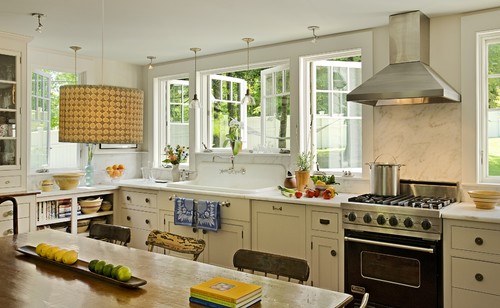
Here's the dilemma: How far should the back splash go? To the ceiling? or just to the hood? I've seen it done well both ways though the trend seems to be to tile to the ceiling (or to tile the whole wall).
Tile to the ceiling:
I have a few issues. I feel if you are going to tile to the ceiling you need to tile up around your cabinets (or have cabinets that go to the ceiling) like this
 |
| via |
instead of ending at the top of the cabinets like this (I know, not to the ceiling but you get the idea).
 |
| via |
Not that either of these kitchens reflect what I want my kitchen to look like (which may be why I am having trouble wrapping my head around it).
Tile to the Hood:
 |
| via |
I love the way this kitchen looks (it even has the dark wood counters, marble and white cabinets I plan to have) but some how the tile looks awkward. I know I've seen kitchens done this way with the tile to the hood (my parent's for instance) but I can't seem to find any online to show you that have the same floating hood that we want. When you have cabinets above your oven it makes total sense. Here is another beautiful example of tile to the hood.
This is nicely framed by those windows so it feels more controlled than the one above.
So I guess this is the dilemma: Do I raise the cabinets and tile to the ceiling or do I do a framed out tile back splash to the bottom of the hood.
Honest opinions please! If you have any good links to your own kitchens or ones you've seen I'd love to see them (and if I offended any one's current kitchen I apologise these are just my feelings on the subject).
Cheers!


I say tile to the ceiling. I think the ones that stop under the hood look a little awkward.
ReplyDeleteI am leaning that way too Ashley. Do you like the cabinets to the ceiling too? Or should they be lower?
ReplyDeleteI like cabinets to the ceiling - less dusting and more storage! I think that the tile should go to the ceiling behind the hood fan if you have one like those pictured above. And then between the counter and the uppers everywhere else. Even if you don't do cabinets to the ceiling I don't think you should tile above them to make it look like it's a full wall of tile. Does that make any sense?
ReplyDelete-Diana
I agree Diana, I like your point about less dusting too.
ReplyDelete